SOLVING PROBLEMS

Defining The Client's Problem
One potential challenge Craft N' Play may encounter when expanding nationally is maintaining brand consistency while catering to diverse regional markets. As the company grows, it might find it difficult to balance its core values—playfulness, safety, and simplicity—with adapting to varying consumer preferences, economic conditions, and cultural differences across different states.
For example, parents in urban areas might prioritize eco-friendly and educational aspects of the toys. Suburban or rural regions place greater emphasis on affordability and stability. Ensuring that marketing strategies, product availability, and messaging remain cohesive while resonating with these demographics could present a significant hurdle.

Creating The Client's Solution
Voice & Tone
There were some complications in finding the right audience, being a local company going nationally. As Craft N’ Play continues to grow, the mission remains to create safe, engaging, imaginative play experiences that empower children nationally. It's believed that every child can explore their creativity and reach their fullest potential with the right tools.

The tagline "Durability Meets Delight" encapsulates the essence of Craft n' Play by emphasizing the balance between robust construction and joyful play. Wooden toys are inherently durable, offering safety and longevity, as highlighted by experts who underscore their ability to withstand wear and tear (Quality Control Supplier Audit Programs, n.d., 2024). This tagline reassures parents that our toys are built to last and are designed to spark joy and creativity in their children.

The name "Craft n' Play" embodies the brand's commitment to durable, high-quality wooden toys while reflecting the values of craftsmanship and imaginative exploration. Drawing inspiration from Madison, WI—a city celebrated for its creative spirit and vibrant community—our brand encapsulates a dedication to local artisanship and sustainability (Mad Facts, n.d.). The name serves as a reminder that while the toys are crafted with precision and durability, the goal is to provide a nurturing space for children to grow, learn, and enjoy their formative years.

Look & Feel
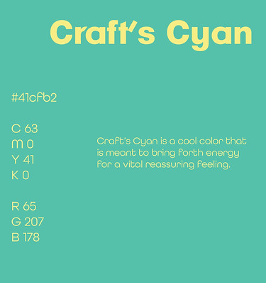
Craft n’ Play is based on stability and safety when selling wooden toys. When thinking of this brand, the first thought is wood that’s been tested to the best of its ability to keep the kids safe. Since these are kid toys, the first base color used was cool because it represents a sense of calmness and security (Stanton, 2024). However, these toys are created to bring out the energy of American children, so a better color to start with is a bright emerald green (RGB #41cfb2).
The second base color is a pastel yellow, representing the joyfulness of these toys while being easy on the eyes (RGB #fcea72). The third base color, which embodies the energetic and inviting side of the brand, is red-orange (RGB #cb593c). Another warm tone that begins the secondary colors is brown (RGB #875b37). Wooden toys are nostalgic and organic, so it’s only right to include this warm, comfortable, and vintage color.
Wooden toys are nostalgic and organic, so it’s only right to include this warm, comfortable, and vintage color. The last two muted colors (RGB # 8ca7a7 and #738364) represent the sophistication and calmness of this brand since it’s still a manufacturing company that must be presented professionally to other shareholders in the United States.

Line quality is essential in graphic design, particularly in conveying messages of safety and stability while reinforcing a brand's theme of durability. A brand can reassure consumers of its stable foundation and trustworthy nature, by employing horizontal lines in its design. Evan Brown (2019) highlights that these lines create a sense of balance, which is crucial for brands emphasizing safety. Horizontal lines are particularly effective for evoking calmness and reliability.
Arrows introduce a dynamic element to the visual language, guiding the viewer's eye and suggesting direction and progress. When used thoughtfully, arrows can reinforce the brand’s commitment to innovation while upholding its messaging of safety and stability. By integrating arrows into their designs with horizontal lines, brands can create a cohesive visual narrative that encapsulates safety, stability, and a strong commitment to durability, appealing to consumers seeking reliability and progress.

The imagery used in branding plays a critical role in conveying messages of safety and stability, especially when it incorporates relatable and positive visuals. Effective brand imagery should evoke emotions that resonate with the target audience (Reid, 2024).

For example, images of children's toys, including pull-along trucks and wooden toys, showcase the brand's commitment to safety and durability in products designed for young audiences. These visuals evoke a sense of playfulness while assuring parents that the products are made from sustainable and safe materials. Together, these images form a cohesive narrative that reinforces the brand's message of safety, stability, and durability, ultimately building trust with consumers seeking reliable and long-lasting products.
Logo Design
The vision board was a foundation for selecting shapes for the graphics and patterns in the logo design process.

The brand name "Craft N’ Play" was broken down into the initials "CNP." Drawing on ideation techniques discussed in the lecture, the designer applied a divergent, non-linear thinking approach after developing the initial logo concept (Baldowski, n.d.).The brand name "Craft N’ Play" was broken down into the initials "CNP." Many designs include repetition to convey a stable, geometric feel that reflects the brand’s values of safety and reliability.


The top three circled logos (32, 83, and 89) are strong contenders for representing "Craft N' Play" due to how effectively they visually communicate the brand’s identity and values. Logo #32 combines circular and angular elements that evoke structure and playfulness, symbolizing the brand's dedication to safety and growth. The circular "C" suggests continuity and safety, while the triangle implies exploration and development, capturing the essence of products that support children’s motor skills and sensory growth. This balance of shapes represents a stable foundation for creativity, making it a compelling choice for a brand that wants to be seen as both reliable and imaginative.

The research highlighted that many wooden toy companies incorporate typography-based or geometric icons, such as circles and triangles, to evoke a sense of durability and timelessness (Antique Toys Library, 2021). This insight influenced the designer’s choice to focus on clean, strong shapes, appealing to parents who prioritize quality and safety in toys for young children.
The early sketch of 32 was more abstract, playing with overlapping shapes. Through revision, it was simplified, with clearer geometric shapes resembling a stylized "C" and "P." Airey (2014) discusses the importance of refining logos for clarity and versatility, suggesting the removal of any extraneous elements that could distract from the core message. Applying this principle, the design was stripped of overly intricate shapes, and adjustments were made to emphasize core geometric forms, allowing for better legibility and stronger brand recognition across various applications.


Shapes influence perception and provide a strong rationale for selecting certain design elements, ensuring effective communication with the target audience. The psychology of logo shapes explains how specific forms evoke emotions and associations—such as circular shapes suggesting inclusivity, while angular ones project strength (Christie & Carson, 2021). Geometric shapes were chosen to create a sense of balance and modernity. Additionally, a vibrant yet balanced color palette was selected to convey creativity and reliability, reinforcing the brand's identity as innovative yet dependable.


Each design element was refined to create a cohesive and compelling representation of the brand's values and mission. Kelly Kuehn (2024) highlights the power of hidden messages in logos, demonstrating how subtle design elements can enhance meaning and engage audiences on a deeper level. By blending symbolism with clean, modern aesthetics, the design elevates the brand’s image and communicates its message clearly and memorably.

Media Assets
Six media assets were chosen for wooden toys, being on the traditional branding side, which is more on the static side. This company is for nationality, and bus stop posters are well-known for being shown across America. These media assets can appeal to parents looking for affordable holiday toys and gifts like baby showers. The media assets have been scheduled according to being completed on time and achieving the best outcome for these branding strategies. The distinction between static and interactive elements highlighted how movement in design draws attention and conveys modernity, particularly in animations, which were critical to maintaining brand consistency across digital platforms.

Static Media
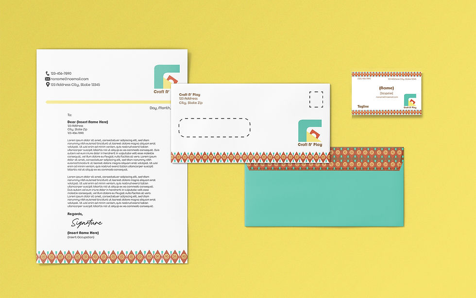
Social media and letterheads bring out the basics of everyone across America, while the uniform presentation shows the fun yet sophistication of the brand, since this is a manufacturing company. David Klein (2022) emphasized the tangibility and longevity of print materials like the letterhead package, social media mockups, and bus stop posters. This resource reinforced the importance of clear branding in physical formats to engage the audience effectively over time.

Developing Craft N’ Play’s media assets reflect a deep commitment to branding strategies that resonate with children and parents alike. A vibrant letterhead package uses bright, cheerful colors, enhancing this appeal, and capturing children’s attention to convey a sense of fun and creativity. Boyd’s (2019) analysis of letterhead designs illuminated the role of cohesive visual communication, shaping the clean yet dynamic patterns in the stationery. The examples showcased how subtle design details, typography, and color could elevate a letterhead's impact. These ideas informed the balance of professionalism and vibrancy in Craft N’ Play's letterhead.

The design process began with brainstorming key elements of Craft N’ Play’s identity, focusing on children, creativity, and safety. Initial sketches laid the foundation for design decisions, balancing vibrant colors and simple shapes that appeal to a younger audience. The business card design followed a similar approach, emphasizing simplicity and functionality while incorporating vibrant patterns that align with the brand's visual identity. The playful border designs and consistent use of brand colors tied the business card seamlessly to the rest of the branding materials. an organized, professional appearance.
The letterhead design balanced professionalism with bright, playful patterns. Careful attention was given to typography, ensuring readability and clarity while maintaining a playful tone through font choice. The brand’s signature colors were integrated thoughtfully, with accents highlighting key areas such as the header and footer. The logo in the upper-left corner provided a consistent brand presence, and the minimal use of negative space gave the letterhead an organized, professional appearance.

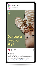
Social media assets drew heavily on industry research to effectively align branding and messaging with the intended audience. At first, each asset contained different profiles and cover images to express the brand. Through feedback and iterative design, the designer refined the colors, slogans, and visuals to ensure alignment with the brand’s goals.
The design process began with brainstorming Craft N' Play’s core identity—playfulness, safety, and simplicity. Inspired by bright yet calming tones, the designer focused on visuals that evoke trust and joy. Ishita Ganguly's (2015) article emphasized the importance of portraying a human connection through social media, particularly for parents seeking trust and relatability. This was integrated into the Facebook cover image, where a smiling child engaging with Craft N’ Play’s toys radiates joy and trustworthiness. It humanizes the brand, making it approachable for families.

Neil Patel’s (2016) exploration of cover images inspired a clean, bold header design. There is a strategy that aligns with Patel's recommendation to use visual storytelling to engage users instantly. By featuring bright colors, a clear slogan “Durability Meets Delight,” and an engaging visual of a child playing, the cover captures attention and communicates both product durability and child-friendliness. The Facebook and Instagram posts prioritize relatable imagery of children interacting with the toys, appealing to parents on an emotional level. The Twitter assets balance fun and simplicity, recognizing that users engage more with content than visuals. The brand applied color theory principles to evoke trust and happiness, utilizing bright yet soothing hues to resonate with the audience. These skills enhanced the ability to produce cohesive and visually engaging social media assets.


The bus stop ad was thoughtfully designed to resonate with parents, capturing their attention and sparking interest in Craft N' Play's toys. The poster emphasizes the safety and reliability of the products, offering parents peace of mind while highlighting the brand’s commitment to their children’s well-being. Every element of the poster works together to establish a nurturing and approachable identity that speaks directly to families.


Paul Inman’s insights on effective outdoor advertising emphasized creating a bus stop ad with a light, calming atmosphere to appeal to busy parents (Inman, 2024). The ad balances emotional appeal and information highlighting toy safety while maintaining visual simplicity, positioned in high-traffic areas. A light and cheerful atmosphere is woven into the design, creating a sense of warmth and reassurance. The playful yet calming tone invites parents to connect emotionally with the brand, portraying Craft N’ Play as a trusted companion in their child’s growth and development.
According to Laity (2023), work uniforms play a crucial role in establishing safety and trust, essential for projecting professionalism. The use of bright yellow in the uniform evokes a sense of happiness and positivity, while olive green embodies professionalism and reflects a sense of national identity. Additionally, uniforms serve as an effective face-to-face marketing strategy, helping businesses attract attention and build recognition on a national scale.


Dynamic Media
The logo animation provides simple, fluid transitions that were implemented to convey movement and excitement. SVGator's (2024) animated logo collection showcased effective animation techniques that inspired smooth transitions and playful movements in the logo animation, aligning with the brand's child-centric theme. Iterative reviews ensured the assets met branding goals, referencing research for refinement.


Bright yet harmonious colors were critical in reinforcing the brand's appeal. The animation’s color palette mirrors the physical product designs, creating consistency across all branding elements. Michael Baker's (2024) article on sonic logos provided insight into the role of auditory branding, emphasizing how sound can create emotional connections and reinforce brand identity.
This perspective inspired the concept behind the logo animation, ensuring that visual and sound elements conveyed Craft N’ Play’s playful and nurturing tone. The gentle, fluid transitions in the animation visually encapsulate the brand’s nurturing spirit, while playful sound effects reinforce its appeal to children. This decision was guided by insights from design research, ensuring the colors resonated with children while maintaining a professional tone that appeals to parents.

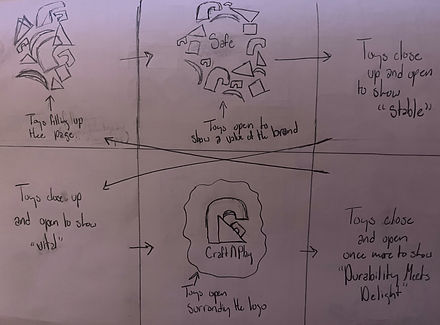
According to Ellis (2018), the storyboard begins with the logo, followed by shapes that move off the frame. These shapes dynamically open and close, revealing the brand’s core values—safety, stability, and vitality—displayed in the heading font from the vision board. The tagline “Durability Meets Delight” appears first, smoothly transitioning into the logo to create a cyclical effect. This continuous loop enhances the animation’s engaging quality, ensuring the brand captures the right attention.

Work Cited Page
58 thing you probably didn’t know about Madison, WI. Mad Facts: Get to know Madison, WI | Destination Madison. (n.d.). https://www.visitmadison.com/media/fun-facts/#:~:text=Madison%20is%20known%20for%20its,and%20Isthmus%20Beer%20%26%20Cheese%20Festival.
Airey, D. (2014, August). Logo Design Love, annotated and expanded edition, Second edition. O’Reilly Online Learning. https://learning.oreilly.com/library/view/logo-design-love/9780133812589/ch04.html#ch04lev1sec10
Baker, M. (2024, November 15). Sonic logos: The role of sound in branding. ZD Blog. https://www.zilliondesigns.com/blog/sonic-logo-and-the-sound-in-branding/#:~:text=The%20purpose%20of%20a%20sound,the%20brand%20itself%20over%20time.
Baldowski, A. (n.d.). Ideation. Full Sail Online Login. https://online.fullsail.edu/class_sections/186413/modules/791204/activities/4549373
Boyd, N. (2019, January 8). The best letterhead examples we could find. PRINT Magazine. https://www.printmag.com/design-inspiration/letterhead-examples/
Brown, E. (2019, May 4). How do you create impact using lines in graphic design?. Design Mantic. https://www.designmantic.com/how-to/how-to-use-lines-to-create-an-impact-in-graphic-design
Christie, M., & Carson, N. (2021, August 9). How to craft a powerful logo shape. Creative Bloq. https://www.creativebloq.com/logo-design/psychology-logo-shapes-8133918
Ellis, M. (2018, May 8). 28 amazing animated logos that will get your brand moving: Vistaprint US. Vistaprint Ideas and Advice US. https://www.vistaprint.com/hub/animated-logos?srsltid=AfmBOooK7zr_Pmt8NkXym5k9c1Emfn07Mhys102_7c18OzbKd6yf1bH3#section1
Ganguly, I. (2015, April 7). 9 ways to humanize your brand with social media. Social Media Examiner. https://www.socialmediaexaminer.com/humanize-your-brand-with-social-media/
HABA USA. (2025, February 4). Blog & inspiration. HABA USA. https://www.habausa.com/blogs/blog-inspiration/6-reasons-why-wooden-toys-are-great-for-your-child
Inman, P. P. (2024, June 13). Bus Shelter Advertising: Is it right for your business? 75Media. https://75media.co.uk/blog/bus-shelter-advertising/#:~:text=Positioned%20in%20high%2Dtraffic%20areas,in%20local%20and%20urban%20settings.
Klein, D. (2022, November 7). What are the advantages of print media over electronic media?. North American Media. https://namericanmedia.com/what-are-the-advantages-of-print-media-over-electronic-media/
Kuehn, K. (2024, October 15). 36 hidden messages in company logos you see all the time. Reader’s Digest. https://www.rd.com/list/secret-messages-company-logos/
Laity, E. (2023, November 16). 50 work uniform examples that Inspire Trust. Printsome Insights. https://blog.printsome.com/work-uniforms-examples/
Patel, N. (2016, June 13). 12 creative ways to use Facebook cover images for business. Social Media Examiner. https://www.socialmediaexaminer.com/12-creative-ways-to-use-facebook-cover-images-for-business/
Reid, M. (2024, January 24). How to select the perfect brand imagery for your business. Vistaprint Ideas and Advice US. https://www.vistaprint.com/hub/brand-imagery
Ruoho, B. (2023, January). The benefits of Wooden Toys. Legacy Toys. https://legacytoys.com/blogs/play-blog/the-benefits-of-wooden-toys?srsltid=AfmBOorlZMDUcEZNUelEidEaLSIkLAZ26Z7z4dTFF3M9LULtziWmPa2V
Stanton, K. (2024, September). Color and emotions: How color impacts emotions and behaviors. 99designs. https://99designs.com/blog/tips/how-color-impacts-emotions-and-behaviors/
SVGator. (2024, May 22). 30 animated logo examples for your inspiration. https://www.svgator.com/blog/animated-logo-examples/#simple-logo-animations-examples
Wooden Toys Quality Control - wooden toys inspection expertise. Quality Control Supplier Audit Programs. (2024, March 26). https://tetrainspection.com/wooden-toys-inspection/#:~:text=Key%20Elements%20Of%20Wooden%20Toys%20Inspection&text=Wood%20Quality%20and%20Safety%3A%20Inspectors,splinters%20or%20other%20potential%20hazards.