RESEARCH

Developing The Brand
The development of Craft N’ Play's branding was influenced by multiple research sources that informed key design decisions, ensuring the brand effectively communicates safety, stability, and creativity for young children. The following discussion outlines the research sources that influenced these design choices, the sources that validate their effectiveness, and competing perspectives that could impact the brand’s overall success.


The choice of wooden materials as the foundation for Craft N’ Play toys was influenced by studies on the benefits of natural materials in children’s play. Drawing inspiration from Madison, WI—a city celebrated for its creative spirit and vibrant community—our brand encapsulates a dedication to local artisanship and sustainability (Destination Madison, n.d.). Wooden toys are celebrated for their strength and longevity, making them safe for children.
.
As experts note, wooden toys are less likely to break than their plastic counterparts, ensuring a safer play environment for babies and toddlers (PoppyBabyCo, n.d.). Ensuring their structural integrity and child-friendliness, the wooden toys undergo rigorous safety inspections (Quality Control Supplier Audit Programs, 2024). These sources reinforced the decision to center the brand around high-quality, durable, and eco-friendly materials, directly influencing the tagline “Durability Meets Delight.” This tagline reassures parents that our toys are built to last and are designed to spark joy and creativity in their children
Building Personality


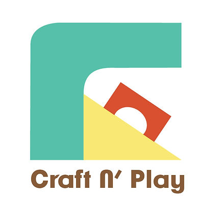
Color psychology played a vital role in brand development, with research guiding the selection of a warm, cool, and muted color palette. The color scheme reflected how the children will respond to the brand with calmness, security, joyfulness, energy, and support (Stanton, 2024). The color palette for Craft N' Play consists of warm, cool, and muted tones - teal, pastel yellow, crimson, brown, olive green, and blue grey.
Typography and line quality were also meticulously chosen based on research into brand perception and readability. Evan Brown (2019) notes that horizontal lines convey stability and calmness, which aligns with Craft N’ Play’s emphasis on safety and reliability. Meanwhile, vertical lines symbolize growth and resilience, reinforcing the brand’s commitment to fostering child development (Iakovlev 2022). The logo and other graphic elements incorporate these principles, using strong geometric shapes and strategic typography to communicate trust and dependability.


Color

Branding imagery plays a critical role in conveying messages of safety and stability, especially when it incorporates relatable and positive visuals. As Meg Reid (2024) notes, effective brand imagery should evoke emotions that resonate with the target audience. Images of children's toys, such as pull-along trucks and wooden toys, reflect the brand's dedication to safety and durability in products designed for younger audiences.
Type
Imagery
Logo Design Process
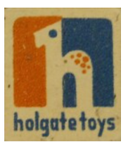

In the logo design process, the vision board served as a foundation for selecting shapes to use in the graphics and patterns. The design used a variety of shapes to emphasize themes of stability and strength, drawing from the traditional association of wooden toys with simple, geometric forms (Robert, 2024). The research highlighted that many wooden toy companies incorporate typography-based or geometric icons, such as circles and triangles, to evoke a sense of durability and timelessness (Antique Toys Library, 2021). This insight influenced the designer’s choice to focus on clean, strong shapes, appealing to parents who prioritize quality and safety in toys for young children.
The early sketch of 32 was more abstract, playing with overlapping shapes. Through revision, it was simplified, with clearer geometric shapes resembling a stylized "C" and "P." This change created a more balanced and stable appearance, aligning with the brand’s values of stability and safety. Airey (2014)discusses the importance of refining logos for clarity and versatility, suggesting removing any extraneous elements that could distract from the core message. Applying this principle, the design was stripped of overly intricate shapes, and adjustments were made to emphasize core geometric forms, allowing for better legibility and stronger brand recognition across various applications.
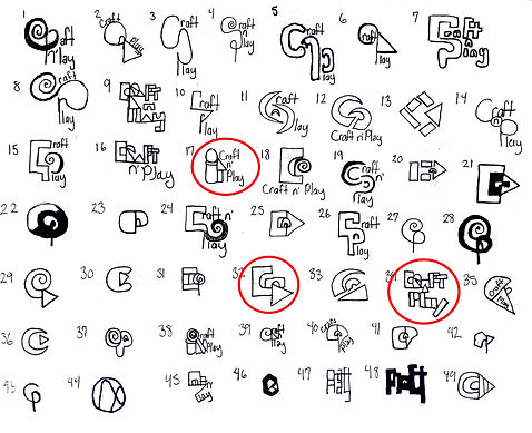

The last presented designs stand out as the strongest choices due to their ability to effectively balance aesthetics with functionality. They effectively combine visual impact with strategic branding principles and convey the brand’s core values with clarity and sophistication. Kelly Kuehn (2024) highlights the power of hidden messages in logos, demonstrating how subtle design elements can enhance meaning and engage audiences on a deeper level. Each design elevates the brand by delivering a clear, cohesive visual identity that is memorable and versatile. The bold shapes and strategic typography create a sense of innovation, appealing to a forward-thinking audience. Additionally, the deliberate use of color psychology, as highlighted by The Logo Company (2024), ensures that the designs resonate emotionally with the target audience, creating a lasting impression and fostering brand loyalty.
Each design elevates the brand by delivering a clear, cohesive visual identity that is memorable and versatile.The geometric shapes were chosen to create a sense of balance and modernity. Geometric logos are effective in conveying structure and order, which resonate well with professional audiences (Peate, n.d.). The clean, sans-serif typography underwent meticulous kerning adjustments to enhance legibility and aesthetic harmony, a critical aspect that emphasizes the importance of spacing in creating polished and credible logos (Gardiner, 2023). Additionally, the vibrant yet balanced color palette was chosen to convey creativity and reliability, reinforcing the brand's identity as innovative yet dependable.
Creating Media Assets

Letterhead
The design process started with sketches for the letterhead, uniforms, and social media layouts. The bus-stop poster and logo animation were refined based on clarity and scalability.


Each stage involved iterative refinements, ensuring all assets aligned with Craft N’ Play's playful yet professional brand image. David Klein emphasized the tangibility and longevity of print materials like the letterhead package, social media mockups, and bus stop posters (Klein, 2022). This resource reinforced the importance of clear branding in physical formats to engage the audience effectively over time. Rigdon’s guided decisions regarding the dynamic elements of the looping animation and logo animation (Rigdon, n.d.). Inman supports the strategy behind the brand’s outdoor advertisements, stating that light, calming visuals in high-traffic areas are more likely to capture attention (Inman, 2024). This research informed the design of Craft N’ Play’s bus stop ads, which balance emotional appeal and product information.
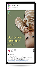
Social Media
Bus Stop Ad
Rigdon’s guided decisions regarding the dynamic elements of the looping animation and logo animation (Rigdon, n.d.). Inman supports the strategy behind the brand’s outdoor advertisements, stating that light, calming visuals in high-traffic areas are more likely to capture attention (Inman, 2024). This research informed the design of Craft N’ Play’s bus stop ads, which balance emotional appeal and product information.

Uniforms
The distinction between static and interactive elements highlighted how movement in design draws attention and conveys modernity, particularly in animations, which were critical to maintaining brand consistency across digital platforms. The effectiveness of these design choices is supported by additional research on consumer behavior and branding impact. Uniforms contribute to brand recognition, influencing Craft N’ Play’s decision to integrate a professional yet playful color scheme into staff attire (Laity, 2023). Similarly, Ganguly underscores the importance of relatable imagery in social media marketing, justifying the choice to feature images of children actively engaging with the toys (Ganguly, 2024).


Animation
Ellis notes that seamless looping animations increase audience engagement, influencing the brand’s choice to develop an animated logo that aligns with Craft N’ Play’s playful identity (Ellis, 2018). The blend of research-informed decisions and iterative design process results in a cohesive and compelling brand identity. Craft N’ Play successfully integrates safety, stability, and imagination, aligning with consumer needs and market expectations.


Work Cited Page
58 things you probably didn’t know about Madison, WI. Mad Facts: Get to know Madison, WI | Destination Madison. (n.d.). https://www.visitmadison.com/media/fun-facts/#:~:text=Madison%20is%20known%20for%20its,and%20Isthmus%20Beer%20%26%20Cheese%20Festival.
Airey, D. (2014, August). Logo Design Love, annotated and expanded edition, Second edition. O’Reilly Online Learning. https://learning.oreilly.com/library/view/logo-design-love/9780133812589/ch04.html#ch04lev1sec10
Are Wooden Toys Safe for Babies?. PoppyBabyCo. (n.d.). https://poppybabyco.com/blogs/news/are-wooden-toys-safe-for-babies?srsltid=AfmBOooAI8Gi7-FSe0Wj7_fzezDiLKZ3v1q4QudFQ6f0tSl5ivvSvpCB
Baker, M. (2024, November 15). Sonic logos: The role of sound in branding. ZD Blog. https://www.zilliondesigns.com/blog/sonic-logo-and-the-sound-in-branding/#:~:text=The%20purpose%20of%20a%20sound,the%20brand%20itself%20over%20time.
Boyd, N. (2019, January 8). The best letterhead examples we could find. PRINT Magazine. https://www.printmag.com/design-inspiration/letterhead-examples/
Brown, E. (2019, May 4). How do you create impact using lines in graphic design?. Design Mantic. https://www.designmantic.com/how-to/how-to-use-lines-to-create-an-impact-in-graphic-design
Ellis, M. (2018, May 8). 28 amazing animated logos that will get your brand moving: Vistaprint US. Vistaprint Ideas and Advice US. https://www.vistaprint.com/hub/animated-logos?srsltid=AfmBOooK7zr_Pmt8NkXym5k9c1Emfn07Mhys102_7c18OzbKd6yf1bH3#section1
Ganguly, I. (2015, April 7). 9 ways to humanize your brand with social media. Social Media Examiner. https://www.socialmediaexaminer.com/humanize-your-brand-with-social-media/
Gardiner, S. (2023, October 31). Logo design and the importance of kerning. Logic Design. https://www.logicdesign.co.uk/blog/logo-design-importance-kerning/
Iakovlev, Y. (2022, August 24). Shape psychology in graphic design. Zeka Design. https://www.zekagraphic.com/shape-psychology-in-graphic-design/ Stanton, K. (2024, September). Color and emotions: How color impacts emotions and behaviors. 99designs. https://99designs.com/blog/tips/how-color-impacts-emotions-and-behaviors/
Inman, P. P. (2024, June 13). Bus Shelter Advertising: Is it right for your business? 75Media. https://75media.co.uk/blog/bus-shelter-advertising/#:~:text=Positioned%20in%20high%2Dtraffic%20areas,in%20local%20and%20urban%20settings.
Klein, D. (2022, November 7). What are the advantages of print media over electronic media?. North American Media. https://namericanmedia.com/what-are-the-advantages-of-print-media-over-electronic-media/
Kuehn, K. (2024, October 15). 36 hidden messages in company logos you see all the time. Reader’s Digest. https://www.rd.com/list/secret-messages-company-logos/
Laity, E. (2023, November 16). 50 work uniform examples that Inspire Trust. Printsome Insights. http://blog.printsome.com/work-uniforms-examples/
Peate, S. (n.d.). What is a geometric logo? Your guide to geometric logo design. Fabrikbrands. https://fabrikbrands.com/branding-matters/logo-design/what-is-a-geometric-logo-geometric-logo-design/
Psychology of color in Logo Design. The Logo Company. (2024, January 2). https://thelogocompany.net/psychology-of-color-in-logo-design/
Rigdon, S. (n.d.). PRINT VS. WEB, STATIC VS. INTERACTIVE. Data + design. https://trinachi.github.io/data-design-builds/ch16.html
Robert. (2024, August 21). Complete Buyer’s Guide to Wooden Toys made in the USA. Made By Liberty. https://madebyliberty.com/the-complete-buyers-guide-to-made-in-usa-wooden-toys/
Toy manufacturer logos. Antique Toys Library. (2021, January 19). https://antiquetoyslibrary.com/toy-logos/
Wooden Toys Quality Control - wooden toys inspection expertise. Quality Control Supplier Audit Programs. (2024, March 26). https://tetrainspection.com/wooden-toys-inspection/#:~:text=Key%20Elements%20Of%20Wooden%20Toys%20Inspection&text=Wood%20Quality%20and%20Safety%3A%20Inspectors,splinters%20or%20other%20potential%20hazards.