COLLABORATION

The Message
The message of Craft N' Play began with the promise of toys to children with active imaginations who need motor skills, sensory development, and social interaction in America. The client should believe us because the Toymakers of Craft N' Play want to ensure safety across America with antibacterial quality and durability that is friendly to the environment.
Feedback 1
" Toys are the product but not the benefit. You want to define what benefits the product will be providing to the target audience...what benefits are being met, and what needs from the list they are meeting...Based on what I am seeing, it feels like it would meet succorance or nurturance...The ideas mentioned here appear to be more about safety or consistency".
- Professor Adam Baldowski
The feedback was necessary because there was a struggle with the message of Craft N' Play. Even though the prompt was based on a "manufacturing" company, the creative express took a turn to reach out to kids and parents. Since this was the starter process, "manufacturing" was the main issue to jump over to make the brand its own. It was either promoted to companies or to parents.
In the end, the theme became security because of what wooden toys can provide. Dr. Sathyanarayana stated that wooden toys would be a better choice for young toddlers and babies (Speller, 2023). This proves that security for children is the best way to go. There wasn't much to discard for this feedback since these were the beginning stages of creating the brand.
New Message: The message of Craft N' Play began with the promise of stability to local stores selling to parents with kids between ages +0-6. The client should believe us because manufacturers have full inspections checking for durability and quality control. Wooden toys don’t contain harsh chemicals and are the safer option for babies. The theme of Craft N' Play is durability.
Feedback 2
"Durability is not a theme. It has to be a visible element.
- Professor Bartley Argo
Creating Craft N' Play started with durability as the theme because wood is durable. However, it had to be based on something visual, such as a forest, mountains, or "Indian Jones," to maintain that consistency within the brand.
At the time, this feedback seemed highly valuable in creating the brand; however, now, it was like an extra step to ensure consistency. It wasn't used to change the message or bring about the onlyness statement.
Onlyness Statement
The onlyness statement contained many drafts during the creative process becuase of a change of theme and the message that can express Craft N' Play to its fullest potential. These were the drafts of Craft N' Play:
Draft 1: Craft N' Play is the only manufacturer of wooden toys in America that proves durability, safety, and stability in local stores, selling to parents with kids between ages +0-6 with active imaginations in need of motor skills, sensory development, and social interaction through quality control and safety test by the company.
Feedback 3
- Professor Andrea Kratz
"It needs revisions...On one side, it speaks about the quality and care of the product created (manufacturing environment); on the other hand, it could be about the toys and the motivation that supports the children to attract parents...There needs to be a choice..."
Final: Craft n' Play is the only creator of wooden toys in America that provides vitality, safety, and stability for parents with kids between ages +0-6 with active imaginations in need of motor skills, sensory development, and social interaction.
Brand Vision Board
This is the first design of the brand vision board. It contained the key elements of the brand and the combination of the look and feel of the brand.

Feedback 4
"Try not to overlap...I would recommend staking the key elements. Expand the blue texture across the board. Also move the title "Craft N' Play" to the upper left or right corner for space."
- Professor Bartley Argo
This feedback was considered to reach for unity and cleanliness in the vision board. The key elements were put This feedback aimed to achieve balance and clarity in the vision board. The key elements were arranged in a tidy stack to prevent ongoing overlaps. This created a clean appearance.
The blue texture had to be discarded due to the loss of elements. However, it was directed toward the center since balance is essential. in a neat stack to keep from the ongoing overlapping throughout the board. This helped create a clean look. Spreading the blue texture had to be discarded due to the lack of elements that would be lost. However, it was pulled towards the center considering that balance is necessary.

Feedback 5
"You've decided to come down to the consumer side...I'm not sure if you want to keep manufacturing in the name. Instead, you could use a secondary name to emphasize the brand... Be more illuminating for the brand..."
- Professor Andrea Kratz
After much consideration, the brand design went into attracting consumers to its product. The feedback confirmed the idea was prosperous, so a few things were pointed out to fit this idea. The vision board contained a few minor adjustments from the design, but there were still complications with the message itself. Changing "manufacturing" to "Toys for Tots co." put the brand in a place to reach the consumers and illuminate the brand even more. This feedback was very important so it wasn't disregarded.

Logo Design
Feedback 6
"Logo #32 contains the C and N, but it may get lost in the creativity of looking like something... For #83, the design is interesting: it shows development and growth, just be careful using an icon as a letter... For #89, blocks are well-known in toy companies, so the logo can get lost or overshadowed by more popular companies... Make sure to place in the word to let the audience know what the logo is for..."
- Professor Adam Baldowski
Logo Idea #32: This feedback provided insight into how symbolism can become dominant through the use of icons. At the time, using icons seemed the best way to go. With that perspective, this feedback was disregarded because an icon seems to fit the generic.
Logo Idea #83: This feedback was on the nail about capturing the idea of growth. In the end, the logo wasn't used, but it was great to know the design was going in the right track. The icons did lose their lettering due to legibility, and the logo was separated as an icon and wordmark.
Logo Idea #89: The wooden block idea was on the fence due to repetition, so the feedback made sense. In a way, the idea was meant to be recognizable, but, understandably, a logo has to set apart from the natural idea. This feedback was taken into consideration.
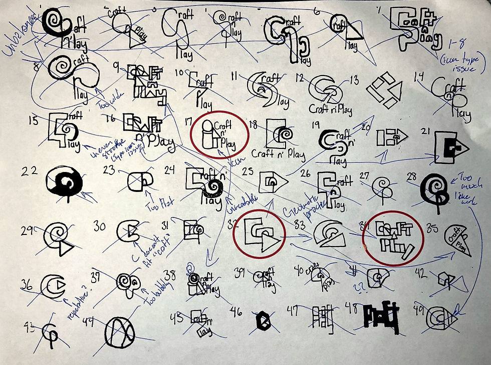


Feedback 7
"These mostly play around with symbolism to where it may be too ornate...Try to stack the words around the icon rather than embedding the word within the icon...Create a focus test to make sure it's legible or soft the style of the blocks within the design... Play with how the name is involved."
- Professor Adam Baldowski
After compressing the 80+ logos into six strong logos, the feedback showed the similarity of how icons were used each time. Using a focus test would help in knowing what could be seen and recognizable. At the same time, the name had to be separated from the icon and played around to see where it would properly fit.

Media Assets
Feedback 8
"There is a practical issue...Remember, it's business stationary, but it doesn't have to be serious, just practical...It's kind of busy... I'm not sure if the pieces are blocks, but they seem like cut pieces of paper...The logo seems hidden, being placed in the corner...The border is a strong element but it may not be best to spread across the design..."
- Professor Andrea Kratz
This feedback pertained to the beginning of the letterhead package created under "before." Initially, it felt harsh that there were numerous mistakes with various shapes and the filled border.
However, the feedback was considered because this is for a business, so less design makes sense in this case. The feedback allowed the changes to the letterhead design in the end.
Before
 |  |  |
|---|---|---|
 |
After

Feedback 9
"The pieces are being built to where you don't have to create something new every time. Instead, you can reuse the header image and logo as the introduction of the social page...The color fade is a new aspect, but it has to be cohesive to the entire social brand. So it has to be simple backdrops or faded colors for consistency for recognition..."
- Professor Andrea Kratz
This feedback pertained to the beginning of the social media package created under "before." Initially, it was meant to have numerous ideas of icons and cover pages with various shapes, typography, and taglines. The bus stop ad only contained an image, logo, and "call to action." The feedback also pointed out there were other missing elements.
The feedback was considered because this is for a business, so fewer icons and headers make sense. It also changes the bus-stop ad to contain a simple background. The feedback allowed the changes to the social media design in the end to be simple theme-based decisions.
Before
 |  |  |
|---|---|---|
 |  |
After


Feedback 10
"It's important for the uniforms to have the brand tagline...Make sure the employee's name is small enough to fit within the uniform..."
- Professor Andrea Kratz
This feedback pertained to the left of the t-shirt design showing the initial design. It only showed the 2D layout with the tagline, name, and logo.
The feedback allowed the design to stay the same but have consideration of the name of the employee. This feedback is relating to take everything in consideration.


Feedback 10
"This is an interesting animation...A shorter version of this could work. Think about having a fun element, a child-like sound effect, or jingles...It could be a combination of things that bring forth the fun aspect of the brand..."
- Professor Andrea Kratz
This feedback was based on the top-right animation for the logo design. It explained that the first three seconds aren't necessary for the animation. It was meant to be simple. This was taken into consideration, along with the idea of adding sound to personify the brand. This feedback had to be used for a better animation.


Brand Playbook
Feedback 11
"I like the overall feel of your playbook...It might help to make 'Craft N' Play' and the photo parallel appealing to the naked eye...It's best to adjust the angle of the image border"
- Tatum Medsker
The feedback above was from a classmate who took a look at the beginning stages of my playbook. They gave me key notes on alignment from a different perspective. This was took into consideration for a better look when introducing the layout.

Feedback 12
"...some of the imagery is in low resolution and takes away from the flow of the playbook. Also, for the Media Applications section, the images do seem to have been stretched instead of being scaled uniformly to fit the mock-ups."
- Tony Aguinaga
This feedback was from a classmate towards the end of submitting the playbook. It was a critique that was based on scaling issues with imagery within the playbook.
However, the feedback was ignored because the scale was uncontrollable. The scale of imagery didn't throw off the whole playbook. The feedback was denied in the end.
Self-Assesement
This was the first of many times a self-evaluation was conducted during this project. Changes came to the brand playbook and the looping animation. Taking time to step back from the projects allows the designer to properly make changes for the better.